How trendy is your website’s design? Does your interface include some of the most visual and user-friendly tools? It’s still not too late to jump on some of the hottest web design trends of 2016. Most of these concepts are rather timeless and will carry into this year.
We’re going to take a look at a few trends that have been going strong in 2016 and look ahead to a few things that we believe will likely continue dominating the world of web design in 2017.
2016 Web Design Trends Going Strong
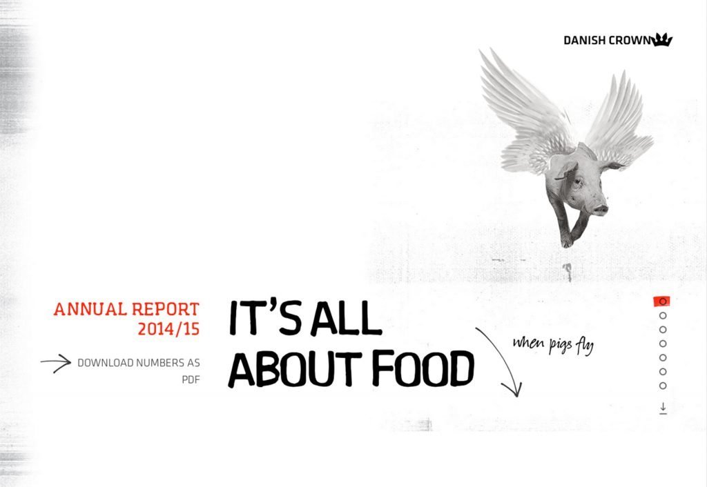
Return of the Scroll
The scroll’s successfully come back in 2016 can be credited it to mobile user patterns. Where small screens make scrolling a necessity, users have retained this habit when interacting with desktop websites as well.
The scroll as an accepted user pattern provides more flexibility because it translates itself well across all devices.
It also provides more flexibility in the design and gives you more of a chance to interact with each visitor, achieves a minimalist look and works especially well for companies that are aiming to tell a story through their website.
Card Style User Interface Elements
These card-like container elements are popping up everywhere and they make a lot of sense for responsive design. A card-based page layout ensures that there are visual breakpoints between the page elements.
Plus, the approach removes clutter – regardless of the amount of copy and images you place on the page.
Cards are a helpful way to organise information, based on the one element per container theory. Each box asks the user to do one thing, whether it is to click on a video, enter an email address or buy an item.
They can work with any visual plan – you don’t need to design for the element. It can match any interface, allowing users to integrate cards into a design without having to change the visual concept.

Video Everywhere
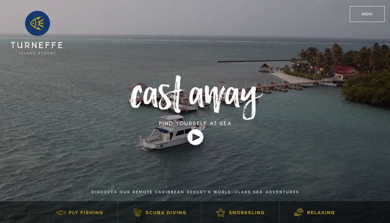
2016 without any doubt was definitely the year of videos. Moving content has become an integral part of web design strategies.
A lot of it has to do more with access to high-speed internet and technology than video itself. Video content has always been popular outside the web, but high-resolution screens and fast connections have opened the door for rapid widespread growth.
But don’t just use any video – users demand high-quality action that tells a story. From short snippets to more cinematic productions, users will only pause to watch a video that’s good. It has to be interesting and relevant to your content.
Bright Colour Schemes
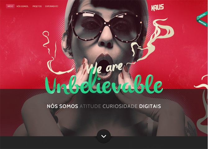
Bright colour schemes are engaging and can help users feel a certain way when they interact with the design. Colour can help bring focus to your message and connect users emotionally with your brand.
The bright colour is also very fun – many users visit websites purely for their entertainment value, whether it is to waste a few minutes while waiting in a queue or to share something with a friend, bright colour schemes encourage these behaviours.
Blues and greens are frequently used, but the trend has also encouraged strong doses of pinks, oranges and purples. The result is a fun, bold, eye-catching visual presence that draws users in.
Predicting 2017 Web Design Trends
Layers and layers
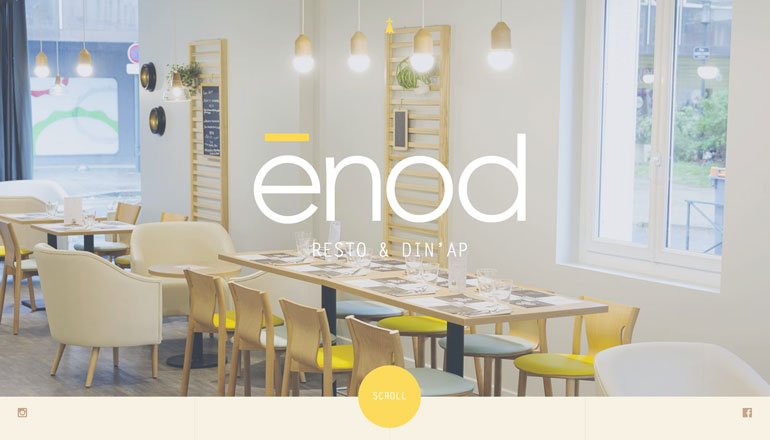
From three-dimensional concepts to elements overlapping each other – it’s a big part of graphic design as well. The trick to making it work is that layers need to look realistic and intentional, so much so that you might not even see them if you aren’t looking.
Gradients in Web Design
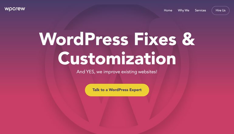
This one is our personal favourite! After being shunned with the introduction of flat design, soft gradients began to re-emerge with flat 2.0 and designers all around have a newfound respect for the technique.
Brightly coloured, two-tone gradients are a popular image overlay effect, as well as gradients used for backgrounds. Gradients are actually a part of the layering process; the colour effect helps create a level of depth for foreground elements when used appropriately.
Oversized Typography in Web Design
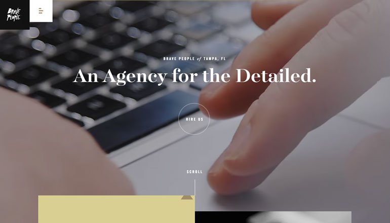
Big lettering is a big deal. Designers are using larger than life typography to help sell the companies message – and it works! Attention spans are shorter than ever now and you have to communicate with a bang to entice users.

Tiny Design Influences
From tiny subtle logos placed in the corner of home pages to micro-designs that grabs the users attention, a focus on the smaller details is a huge part of the design.
A few years back the design philosophy was mobile-first so that you designed for the smallest device and scaled the visuals up.
Today, that smallest device could even be a watch. Every design element must be created with intent and purpose – there’s no place for elements that don’t help the user reach some sort of goal.
Conclusion
The best and most timeless trends are those that aren’t full-scale overhauls. They can work within a number of different design patterns.
For example, you can add a bright accent colour to almost any website. Oversized typography can replace smaller text in almost any framework.
Start small when working with trends and add one element that works with your existing design and branding. See how users respond before moving on to bigger changes. Good luck!